Kahli Design official logo
HomeAboutMy LinkedIn

Ascending Official Covers

Graphic Design
Ascending
Graphic Design
2026

My own original series. Upon request, I released a beta version and gathered feedback on marketability and retention for new readers. Responsises were overwhelmingly positive.

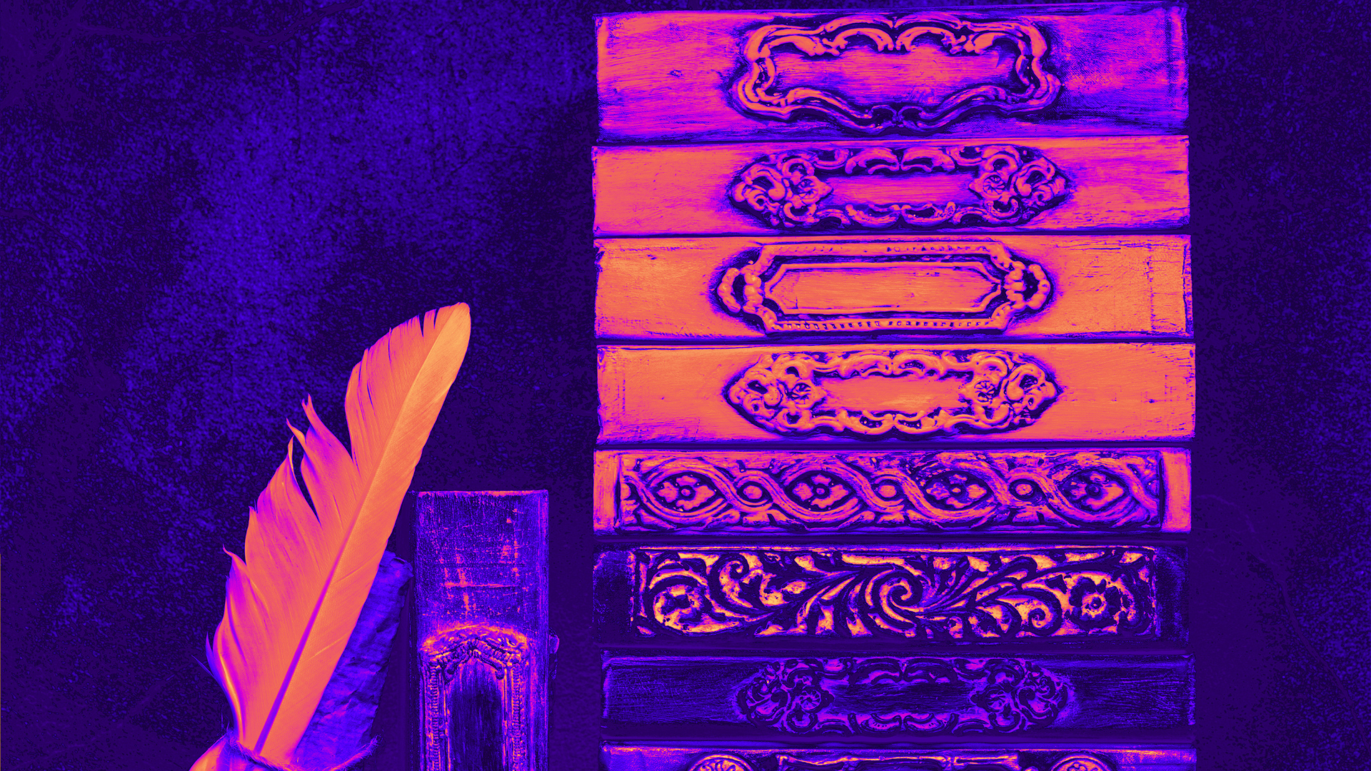
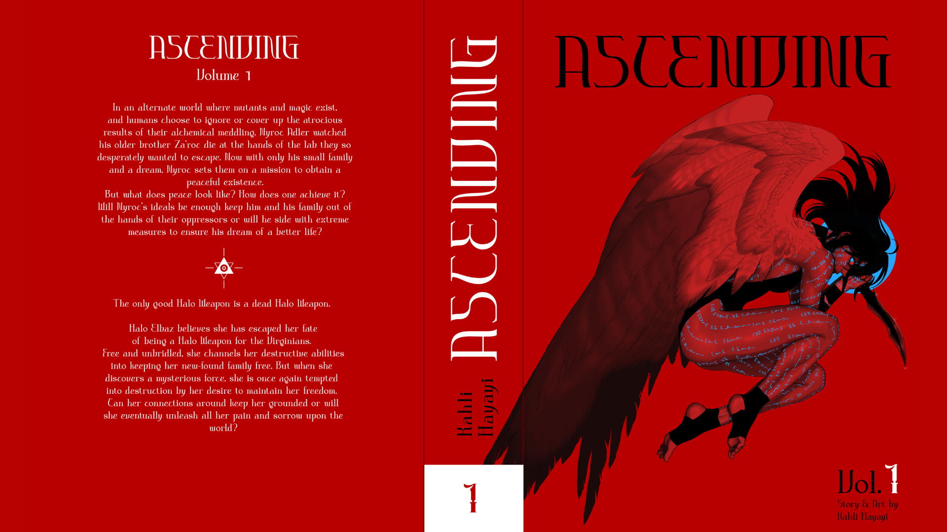
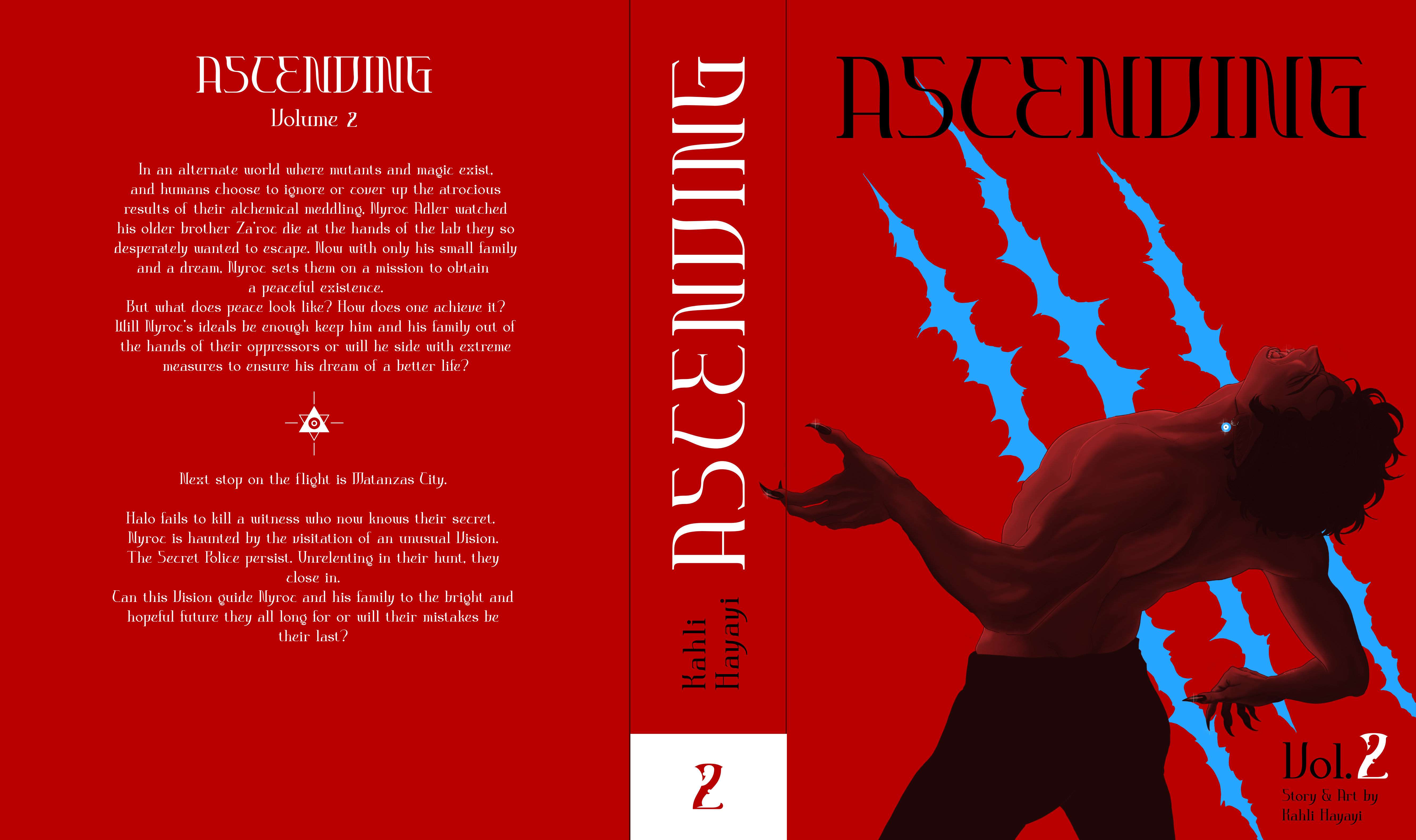
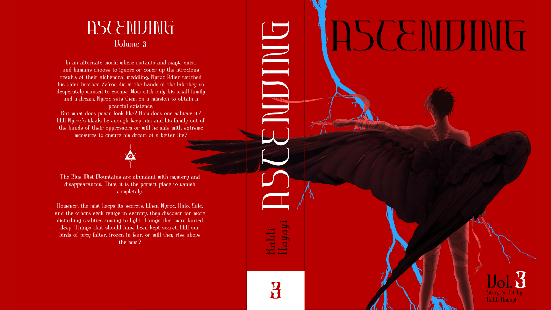
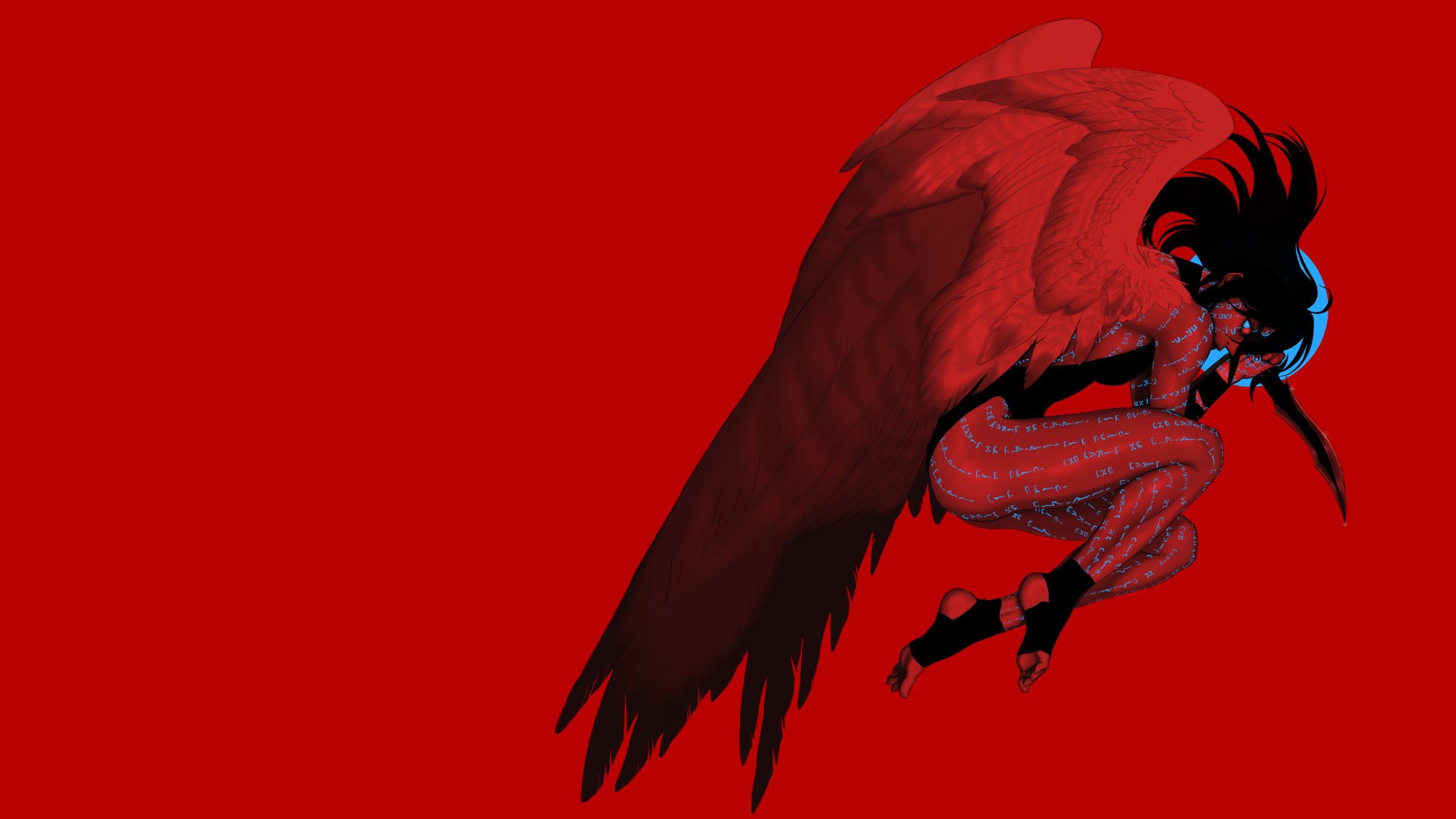
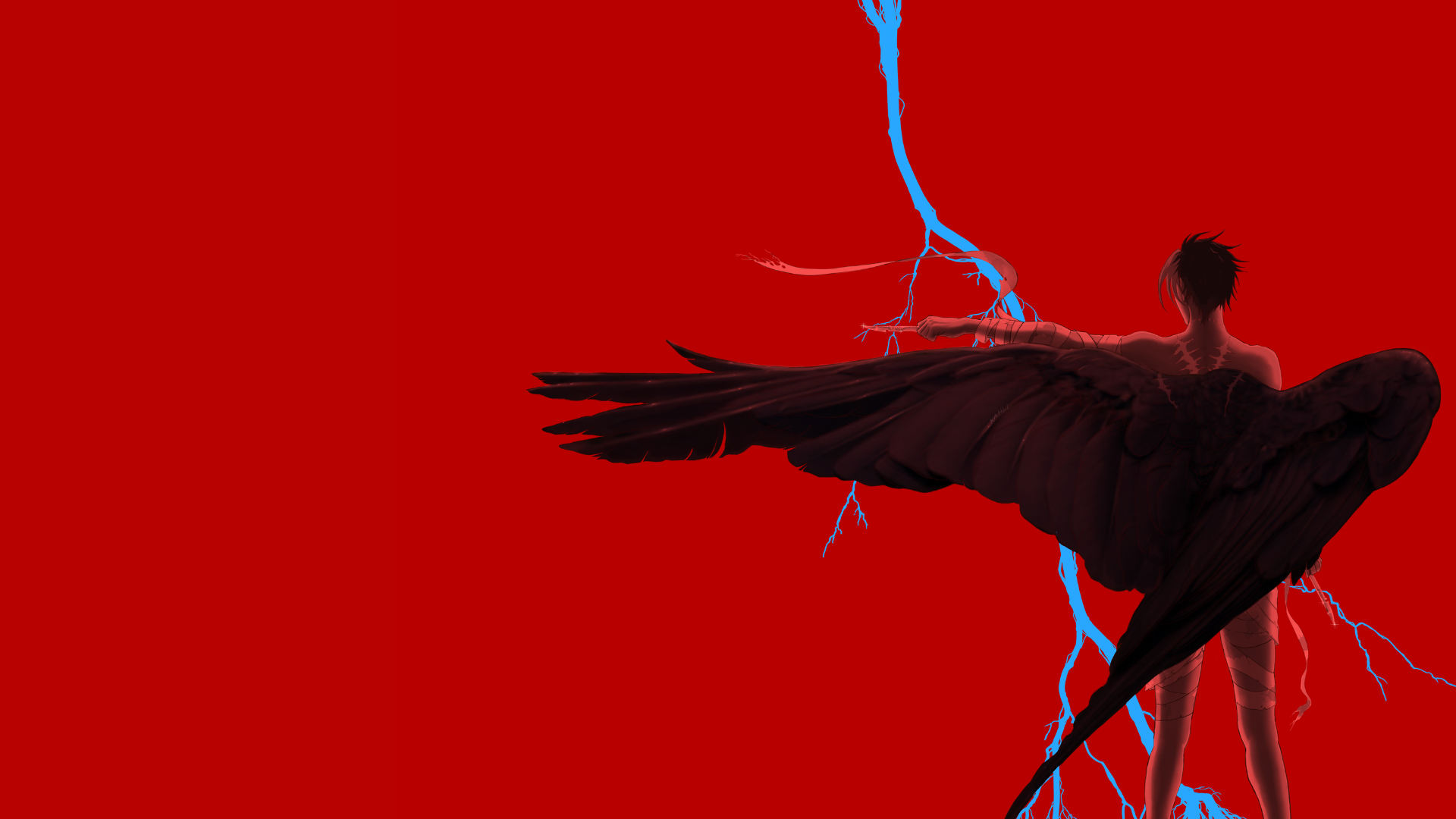
A compelling book cover for a creative intellectual property should visually encode the core narrative while signaling its uniqueness within a crowded market. The design process began by identifying the story’s thematic spine—conflict between tradition and transformation—and translating that into a layered composition where organic, hand-drawn textures intersect with sharp, geometric forms. This contrast reinforces the tension at the heart of Ascending while immediately catching the viewer’s eye at thumbnail size. Color choices were intentionally limited to a bold, triadic palette to ensure memorability and brand consistency across future installments, with a dominant hue anchoring the emotional tone and accent colors guiding visual hierarchy. Typography was selected not just for readability but for personality, subtly echoing the world-building through custom ligatures and spacing that feel distinctive without becoming distracting. Negative space was carefully preserved to avoid visual fatigue and to create a focal point that draws the viewer inward, suggesting depth beyond the surface. Altogether, the cover is designed not merely as an illustration, but as a strategic entry point into Ascending's world—one that communicates genre, mood, and originality within seconds while remaining flexible enough to evolve alongside the property.

  • Use of Red Vs Blue: Red represents many thematic elements. From life blood to the philosopher's stone, the use of red not only stands out from others' copies on crowded shelves, but communicates the rage and danger the characters possess and face throughout this dark science-fantasy story. The minimal and simplistic splash of blue, represents both sorrow, hope, and otherworldly energy. A very intentional color scheme choice as if red were any brighter, readers would experience eye-strain and headaches instead of a unique and intriguing experience.
  • Use of Andromeda in Typography: Andromeda is the chosen font for the title cover not only for it's readability, but also for the type face's portrayal of personality and brand for a dark science-fantasy.
  • Overall, I wanted to keep this design minimalistic without sacrificing personality, marketability, and brand uniquenss.
Check It Out
View Project Arrow.
No items found.

Other Projects

Striking book covers
Graphic Design
Ascending Official Covers
Cake-shaped candles that are warmly lit.
UX/UI Design
Candles By Victoria
A happy little gnome in a lush landscape.
Branding
Lawn Gnomes Landscaping
Designing logo variations.
Graphic Design
Logo Design
A portal.
UX/UI Design
New Employee Portal
Upper and Lower arch model of teeth
Information Architecture
TSD Business Site
A delicious line of juicy burgers from a food truck.
Web Design 
The Hungry Lab
Kahli Design official logo

Creative. Communicative. Consistent.

Ascending Official Covers
Logo Design
The Hungry Lab
Lawn Gnomes Landscaping
Candles By Victoria
New Employee Portal
TSD Business Site
linked in linkdribbble link